
How to Design a Minimalist Logo; Key Principles and Techniques in 2024
Do not confuse a minimalist design with an unfinished look minimalist logos are effective with their strength of design alone and don’t need intricate adornment to rely on
Less is more is still a new concept, however, it does exist in the late 1960s in American visual art. Since the less detailed design is easier to recognize, minimalist logos are effective with their strength of design alone and don’t need intricate adornment to rely on. In minimalist graphic designing, the artist avoids unnecessary components and uses the most basic elements essential to produce a product or design.
The designer strips away unnecessary features and opts for clean lines and deceptively simple geometric shapes to create an impactful mark as an intricate design. However, do not confuse a minimalist design with an unfinished look. These logos are not simplistic; with their clean, modern approach, they deliver a lot with little. They usually use monochromatic color palettes with simple shapes and can be used to imply multiple mediums including company logos, business cards, etc.
Since this art comes with a horde of benefits, minimalist logo designs have become a hot topic and designers opt for them as a great place to start any design even if they don’t want to end up with a minimalist logo. They use minimalist design as a strong foundation core for all logos.
Where the fewer elements of the design make it easier for the web page to load, the design conveys your brand’s information with ease. Minimalist web designs are easier to optimize and crawl, hence increasing the probability of a website appearing in search results. Responsive websites ensure a better customer experience and the minimalist logo integrates better with SEO.

Pre-designing a Minimalist Logo to Enhance Brand’s Visual Identity
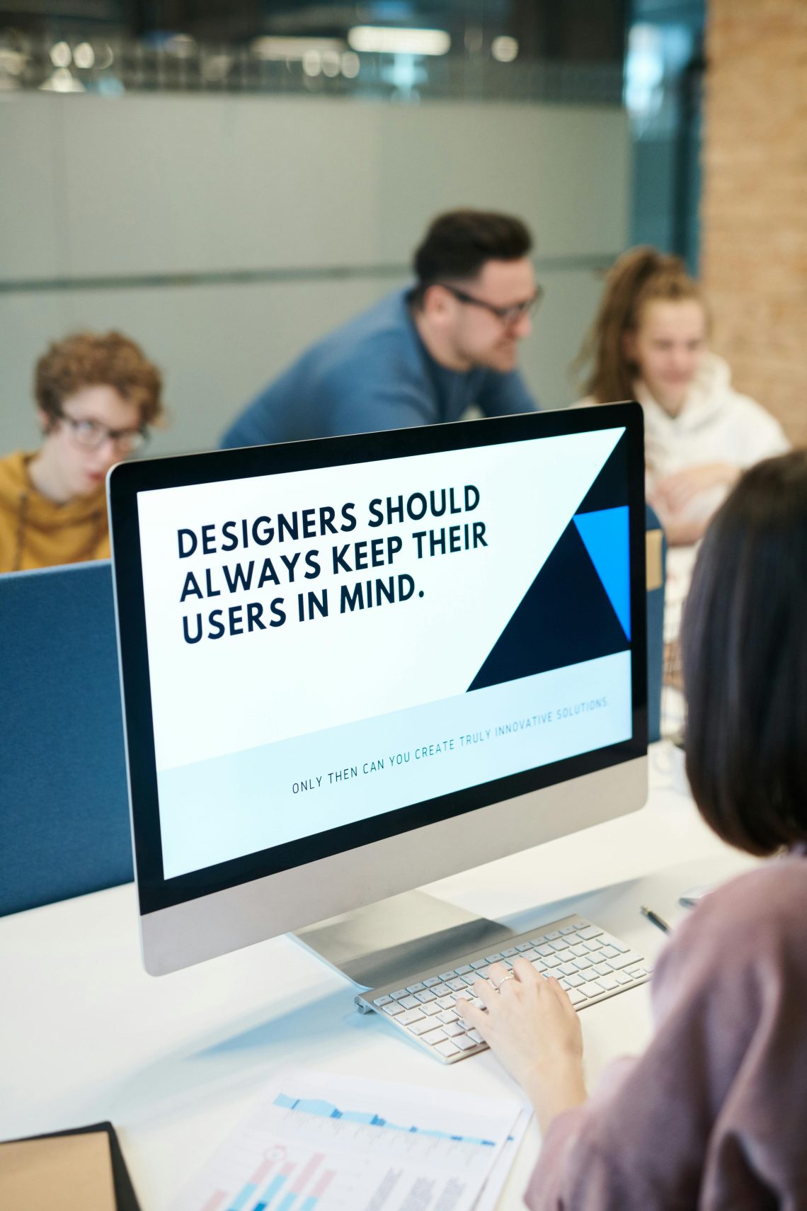
A brand’s visual identity circumscribed everything from its colors to website design, and fonts to logos. This makes it essential to know the client and their requirements, mission, values, attributes, competitors, and audiences before initiating the project. This is because, sometimes clients are aware of their requirements but don’t know how to deliver them through communication.
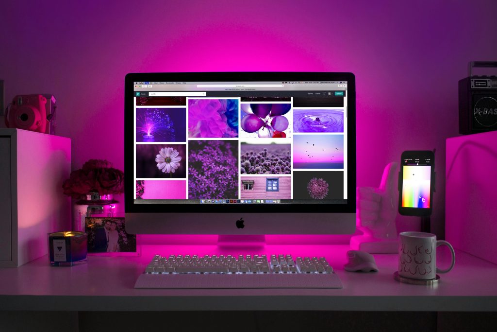
The problem is addressed with Moodboards which are designed to share the reference points throughout the process. Moodboards work as a visual guide for your client and are equipped with a collection of images, visual cues, colors, and logos, giving them a direction to start with.
Key Sketching Ideas
This is the first stage and the sketches you make here don’t need to be perfect. Remember you are just discovering a direction. Begin your initial ideas with pencil and paper as sketching allows you to explore various ideas freely without technical constraints. Jot down words, phrases, or images that come to your mind.
Try out simple yet impactful shapes, forms, and compositions. Create multiple sketches and work with different variations to refine your design. Don’t show these sketches to the client as it will be hard for them to understand the final product at this stage.
2. Bring Your Design to the Digital Realm
Once finalizing a solid sketch, digitalize your minimalist logo and choose your tools to bring it to digital life. Tools like Sketch, Figma, and Adobe Illustrator are usually preferred to create a vector version of your sketch. Using these tools will help refine your logo with necessary adjustments and your logo stays sharp and crisp at any size.
To make it visually appealing look for greater flexibility and scalability on various platforms like digital and print materials. As you digitalize your minimalist logo, keep in mind that flexibility and scalability are essential. Your design should look great on various devices, platforms, and print materials.
3. Fine Tune Your Design
After designing the minimalist logo shape, refine it with details. Check the balance and proportionality of the element including size, placement, and alignment. Make sure that all the elements are harmoniously balanced, enabling a consistent brand identity. Colors should be fine and clear which makes the design easy to understand and recognize at first glance.
Key Principles For Minimalist Logo Design
- Simplicity is paramount in minimalist logo design and the designer avoids using too many graphic elements in the design project. For instance, limit the font choice to a maximum of two fonts while using a short and relaxed color palette. The design must focus on delivering the necessary information only.
- Prioritize functionality and assimilate minimalism into graphic design while focusing on accessibility over the aesthetic.
- Your design must engage the audience for visual hierarchy and they should grasp the information the design is transmitting. This refers the designer to following the rules of visual hierarchy. Organize the information and deliver it to viewers’ eyes. They should look at what you want them to see and the focal point should be the main information about the brand.
- Never ignore the logo proportions.
Key Techniques for Designing a Minimalist Logo
After the minimalist design is ready to go, make sure it remains versatile and adaptable for different platforms. It should work well with different sizes, colors, and formats to ensure that it looks best no matter how and where it is used.
- First, make it adaptable for different sizes. It should be clear and recognizable at variable sizes. Therefore, test your design at different scales from large billboards to profile images, and make sure that essential images are legible and visible.
- The design should be responsive at specific size ranges, from a larger more detailed version to a simplified smaller screen version.
- Another crucial aspect is creating color variants that work on different backgrounds including presentations, promotional materials, and websites. Choose primary color versions and the version of the logo must comprise the brand’s main color. Develop a version of the logo with a single color usually black and white to use it on multiple backgrounds.
- Prepare file formats for different applications. Vector formats include AI, EPS, and SVG. While Raster formats include JPEG, PNG, and GIF.
Conclusion
Create the minimalist logo design variants and share them with your client to gather feedback and make revisions. The design that appears perfect to you may have some outer perspectives and potential issues for your client. Therefore, discuss it with your client and work on the areas of improvement.


2 Comments
Pingback:
Pingback: