

Dashboard Design and Development in 2024; A Complete Guide
Explore the Dashboard design tips that include the most important content with the most efficient visualization.
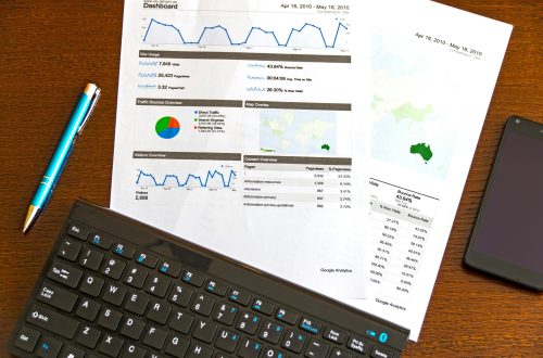
Dashboards, being a powerful way to present data-based intelligence, should be designed to ensure a quick and easy scanning format of relevant information. Dashboards use data visualization techniques to display relevant and actionable data and key performance indicators.
The term dashboard was derived from an automobile, and they have the same function in the digital world. If you can utilize the dashboard properly, you can use its insights from data to make better decisions. However, most of the dashboards need better layout and navigation. Therefore, it is necessary to understand dashboards first, and they are divided into three types;
- Operational Dashboards provide real-time data related to daily operations
- Analytical Dashboards are interactive and serve for trends. They influence your future decision-making.
- Strategic Dashboards track KPIs and strategic objectives.
- Tactical Dashboards display high-level performance monitoring
Regardless of the type of dashboard you create, make it successful by following the given steps.

Understand the Importance of Data Visualization
Data visualization presents data through graphics and pictures and helps you to identify patterns or understand difficult concepts that go undetected in text-based applications. You must have the right approach to data visualization, as it is the foundation of designing dashboards.
An effective dashboard simplifies the visual representation of complex data and shows actionable and useful information instantly. It not only helps stakeholders to understand and analyze key insights but also to present them clearly and efficiently. They show the latest trends and data updates and communicate information quickly.
Customizing the visual data and information at the initial stage helps improve usability and you don’t need to use different user personas. With the help of a dashboard design, your data is prioritized, immediately accessible, and displayed clearly in the visual hierarchy. The better the design, the more efficient the display of elements like forms, charts, and tables allowing you to use filters and customize how your data will be displayed.
Prototype The Dashboard Design
Choosing a dashboard design depends on functionality and above mentioned four UI designs. Here’s how you can create a prototype of different dashboards and use them according to your needs.
Analytical Dashboard UI Design
Analytical dashboards show historical data and enable users to analyze key demographics, user locations, and traffic sources. With the help of these dashboards, they can also identify trends to make predictions and decisions according to marketing strategy.
These dashboards are used to show a high-level overview of graphical representations or data in single numbers. Analytical dashboards are used by product designers to simplify and display vast amounts of data.
Operational Dashboard UI Design
These dashboards display operational-critical information. Operational dashboards show real-time or short-term data, and this data changes regularly in real-time according to the changes in its sources.
Strategic Dashboard UI Design
These dashboards summarize complex data, allowing users to track performance against KPIs. A strategic dashboard allows user to identify their strengths and weaknesses by displaying their goal, current status, and projections they need to meet the target.
Tactical UI Dashboard Design
These dashboards allow users to monitor performance towards an objective. Tactical dashboards work as a strategic or operational hybrid and visualize overall and segmented performance guides to enable strategies and decision-making.
Test Your Dashboards
If you are a dashboard builder who continuously works on planning, creating, and requesting feedback on your designs, then you will be very confident about your work. However, you should not skip this crucial step of testing your dashboard.
There are multiple complaints from customers that you should pay attention to avoid any of these in your dashboard design. The poor visualization functions, glitchy interface, and difficulty in accessing reports are some of the most common issues. Sometimes the dashboard also generates different results for users while working off the same data sets, making it hard to interpret the progress.
Thats why you need to analyze and fix these dashboard weaknesses by testing their functionality. After facing these inconveniences, many firms show reservations about moving to any other platform.
Deploy Your Dashboards
Although your dashboard is a brilliant creation of yours, you need to consider the requirements of end users. Your end user may not understand the navigation and technical aspects of your dashboard, or the terminology you have used may be fairly difficult for them to get along with.
To counter these issues, keep your end-users integrated into the working of your creation, even if the dashboard is in the development stages. This will not only help them understand your vision of expected results, but they will also know how your work will be beneficial for them.
Integrate Relevant Stakeholders
As we said, you need to involve your stakeholders. Usually, IT departments provide their end-user with brief tutorials to understand the functionality. That approach does not drive much of end-users to use that application frequently. You are the provider of the dashboard design, and you need to personalize the application, clearly explain the benefits, and show enthusiasm about its enactment.
If many parties are all involved in the dashboard creation process, then make sure that all stakeholders are on the same page and consult and involve them at different stages throughout the process. Your data team should collaborate with your provider and ensure that data updates are seamless and are a perfect lead toward the health of your firm’s data infrastructure.
Conclusion:
You need to understand that most technology-inclined solutions are difficult to implement. But you should not be discouraged by these problems and follow the best practices of dashboard design and the development process until you complete all the necessary steps to fix the issue.


5 Comments
Pingback:
Pingback:
Pingback:
Pingback:
Pingback: